Visual style of the city Ostrov
Logo and orientation plan
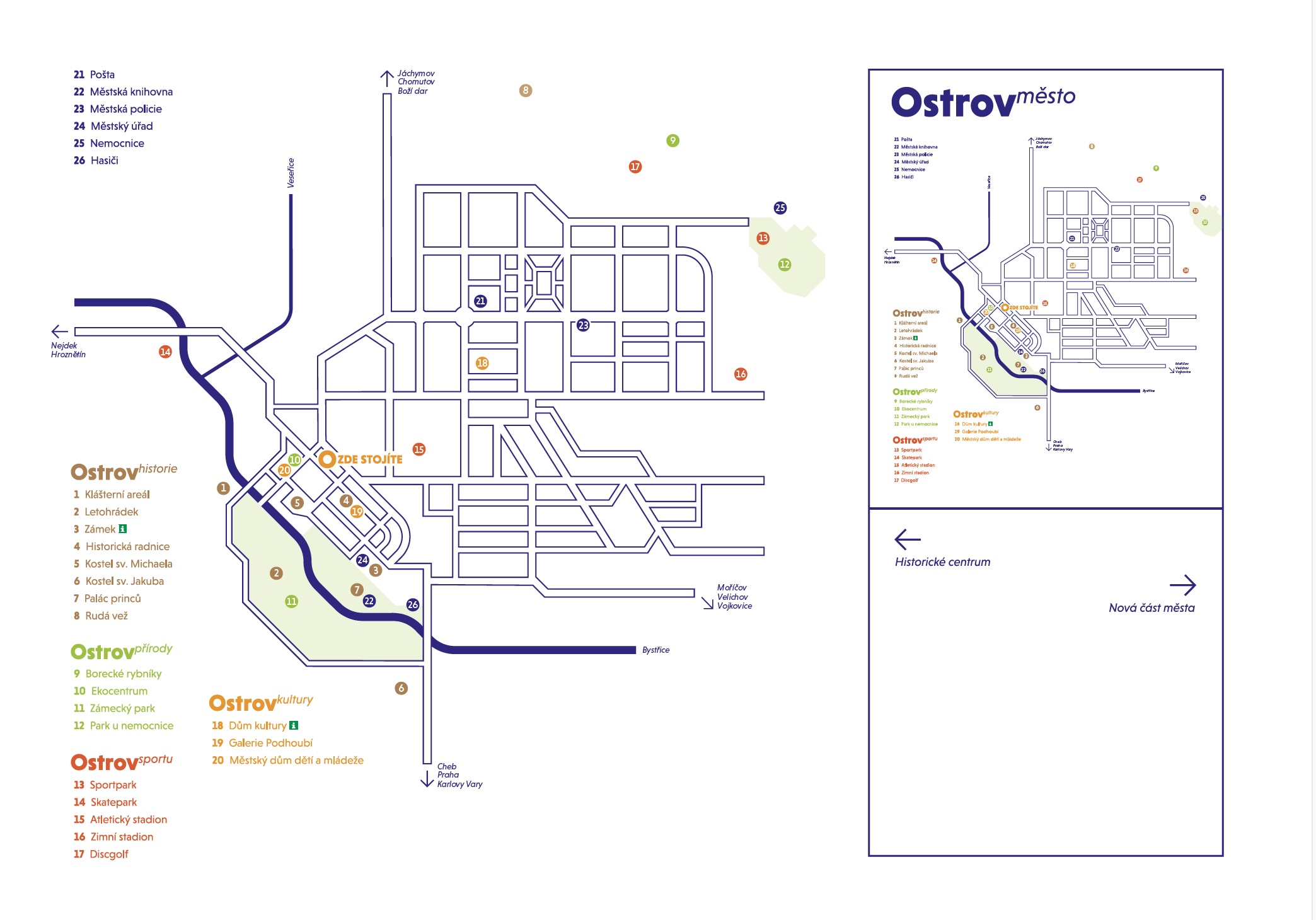
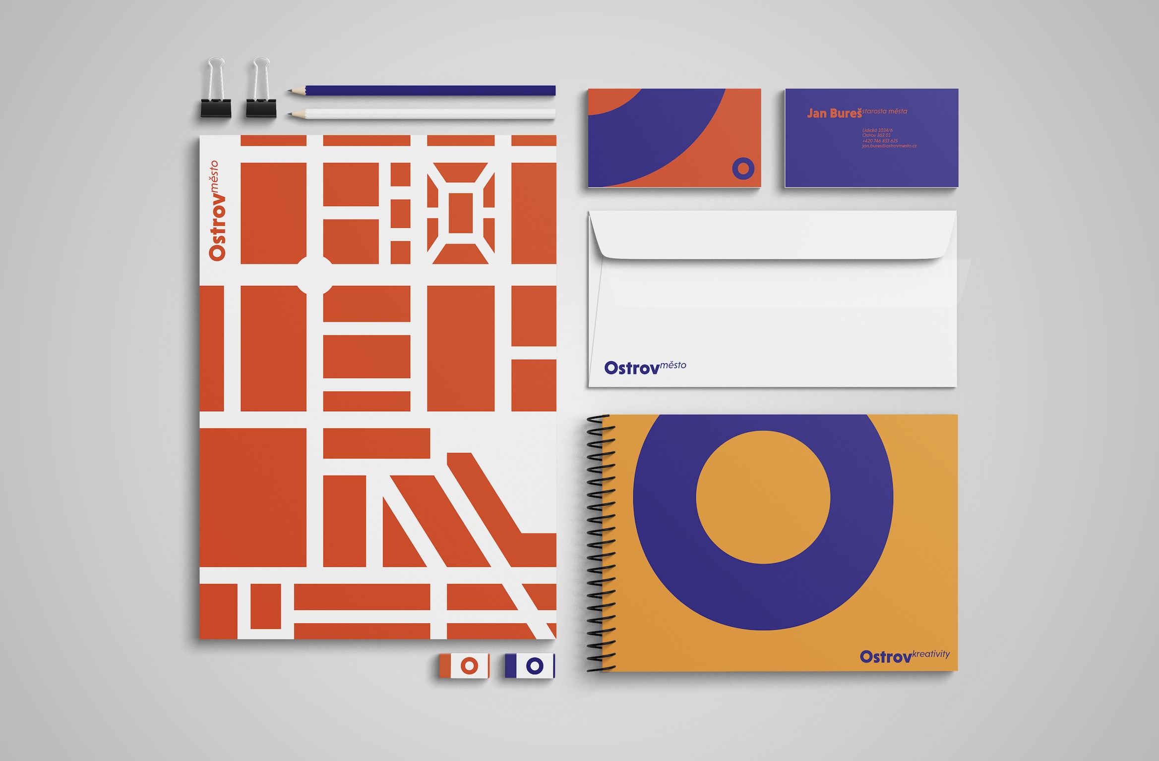
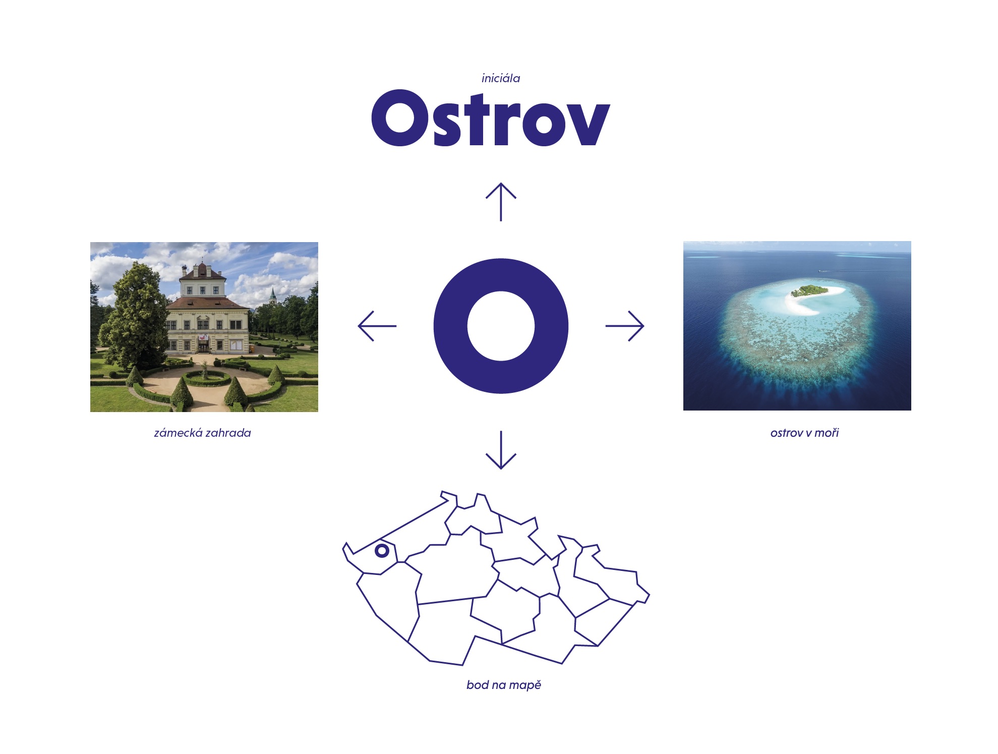
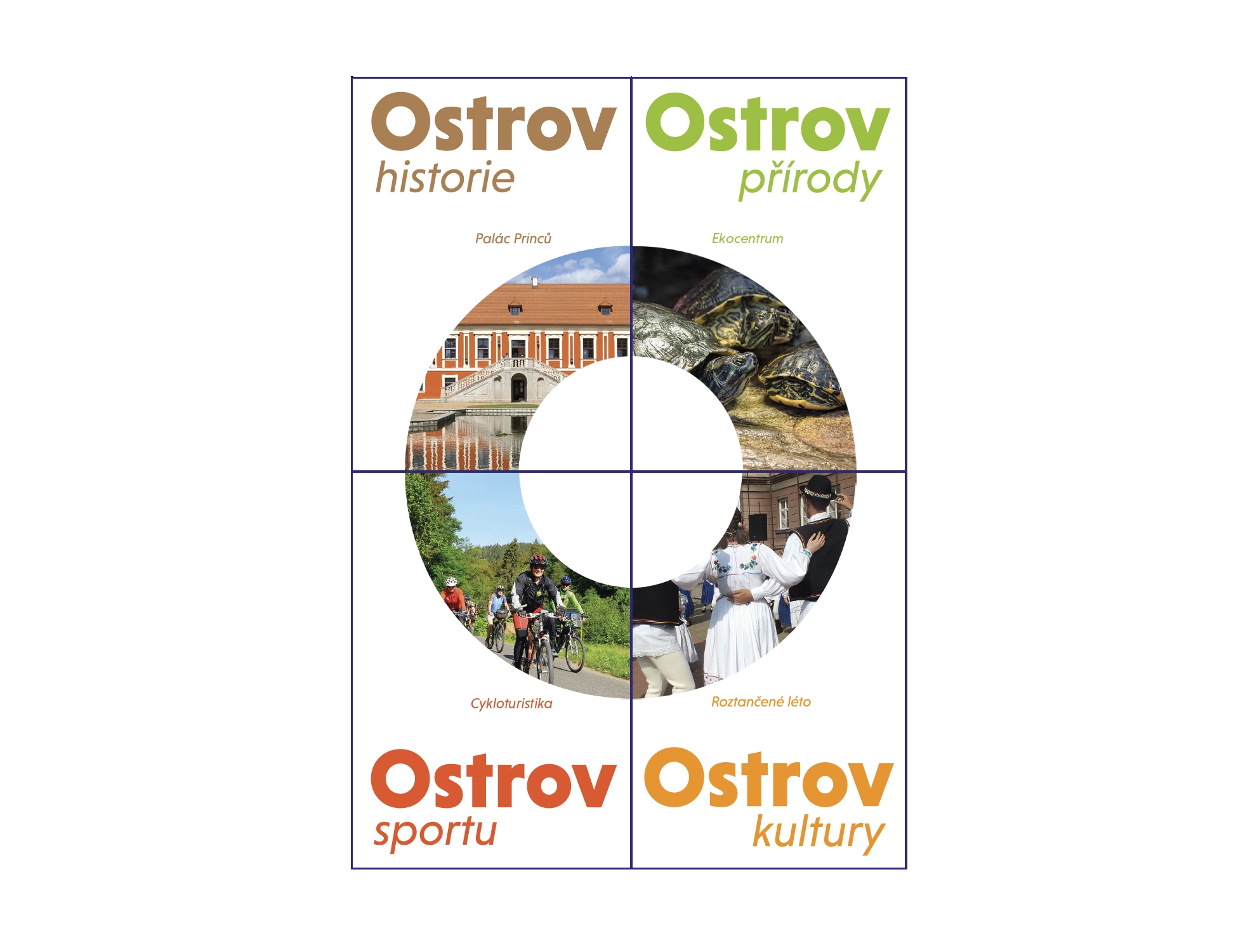
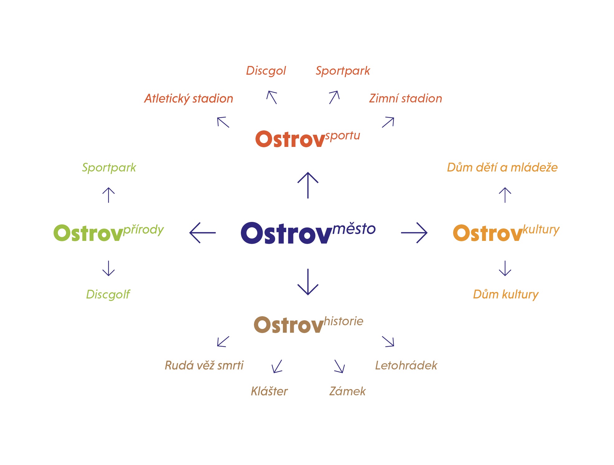
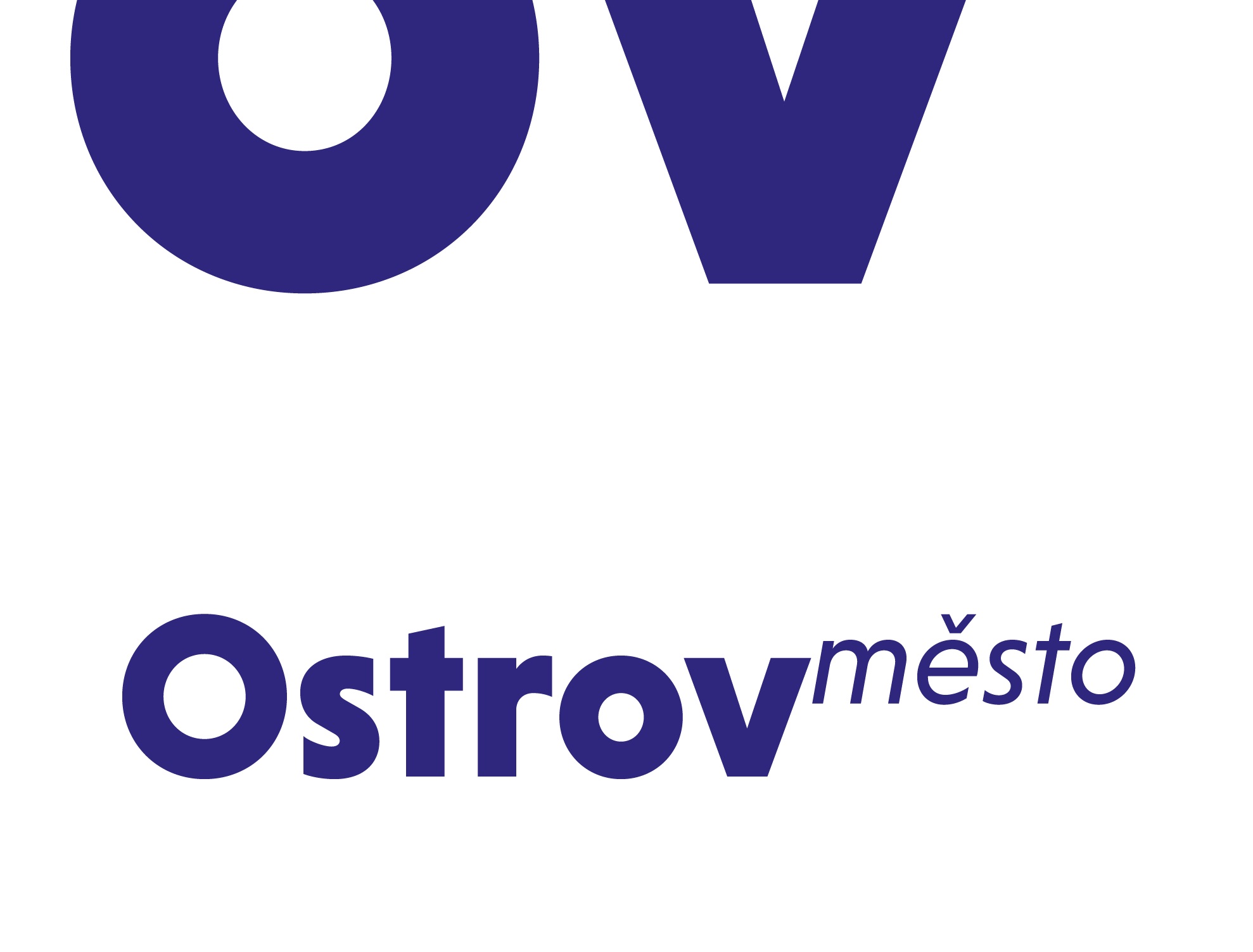
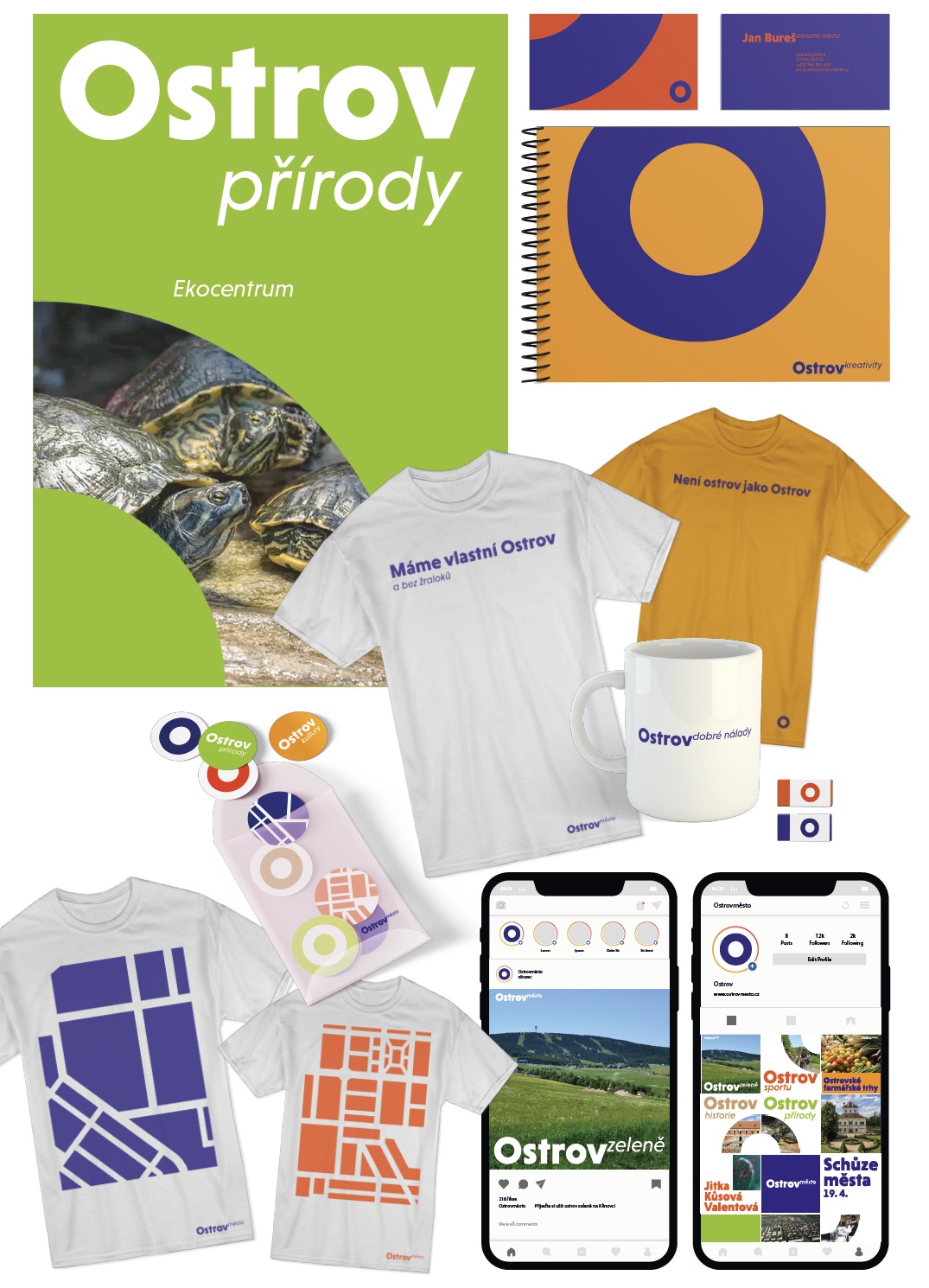
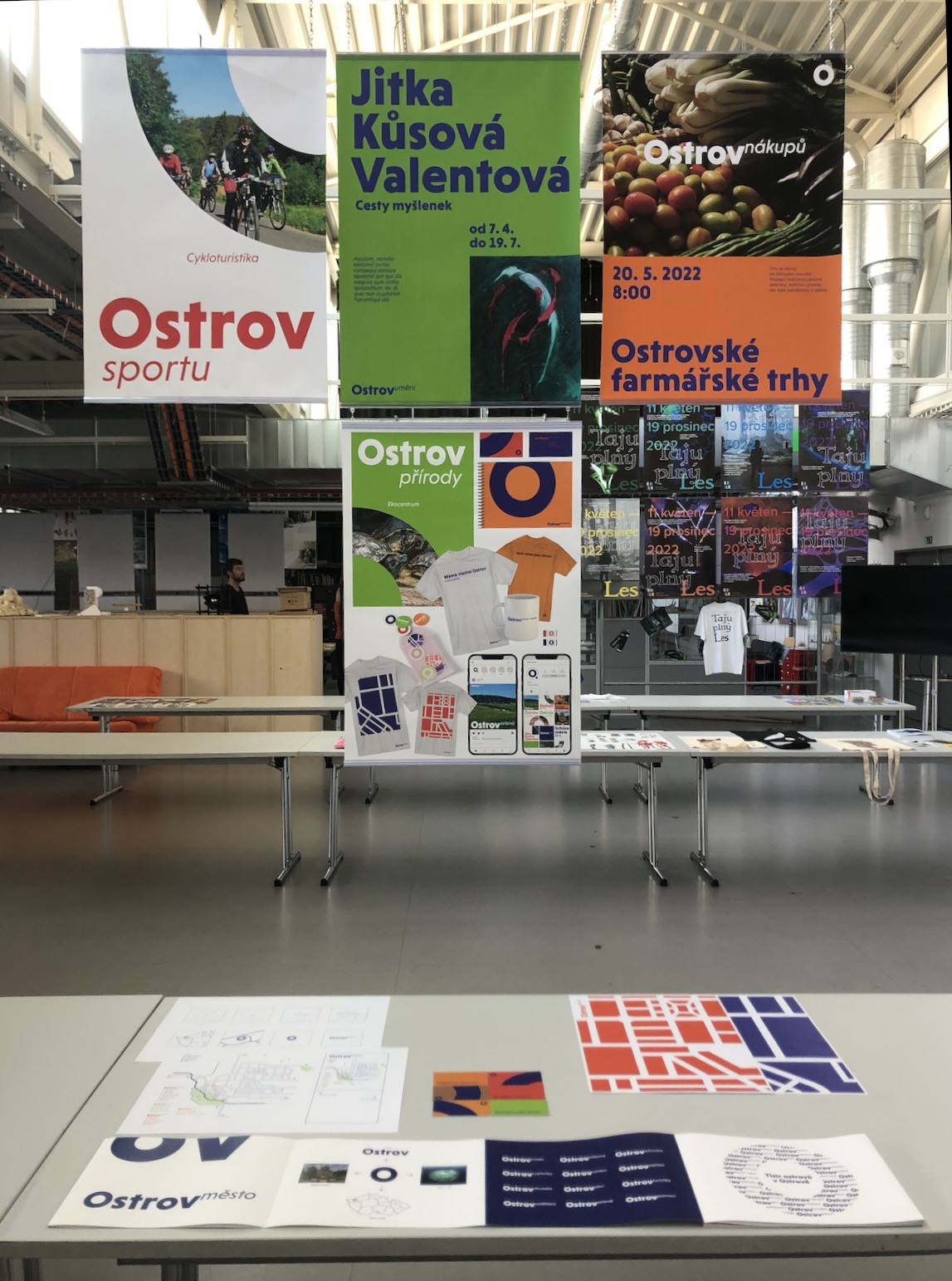
I designed a typographic logo, with the dominant letter O and the suffix a city that became the basis of the entire visual style. The logo is variable, because we can write other specifications for it, such as Island Education, Island Cycling, etc. This will create smaller “islands” of activities, places, emotions, etc. I divided the city map into four main categories - Island History, Nature, Island Culture and Island Sports and I assigned one color to each. The overall visual identity uses the round geometric shapes of the letter O in contrast to the square shapes based on the city map.