Zlin Design Week 2019
Outstanding student design
The poll is over. Thanks to all participants!Martin Egrt & Milan Quang Nguyen
Univerzita Tomáše Bati ve Zlíně
REVOLUTION
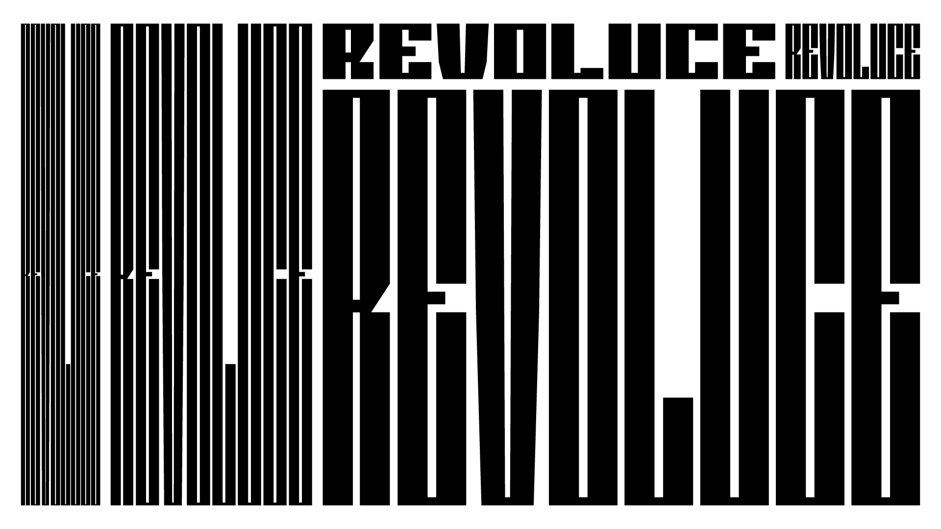
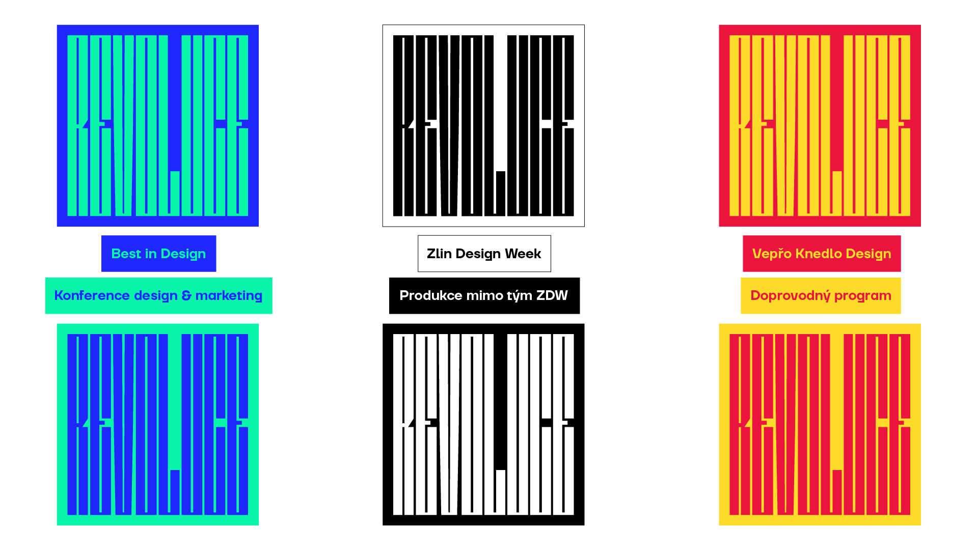
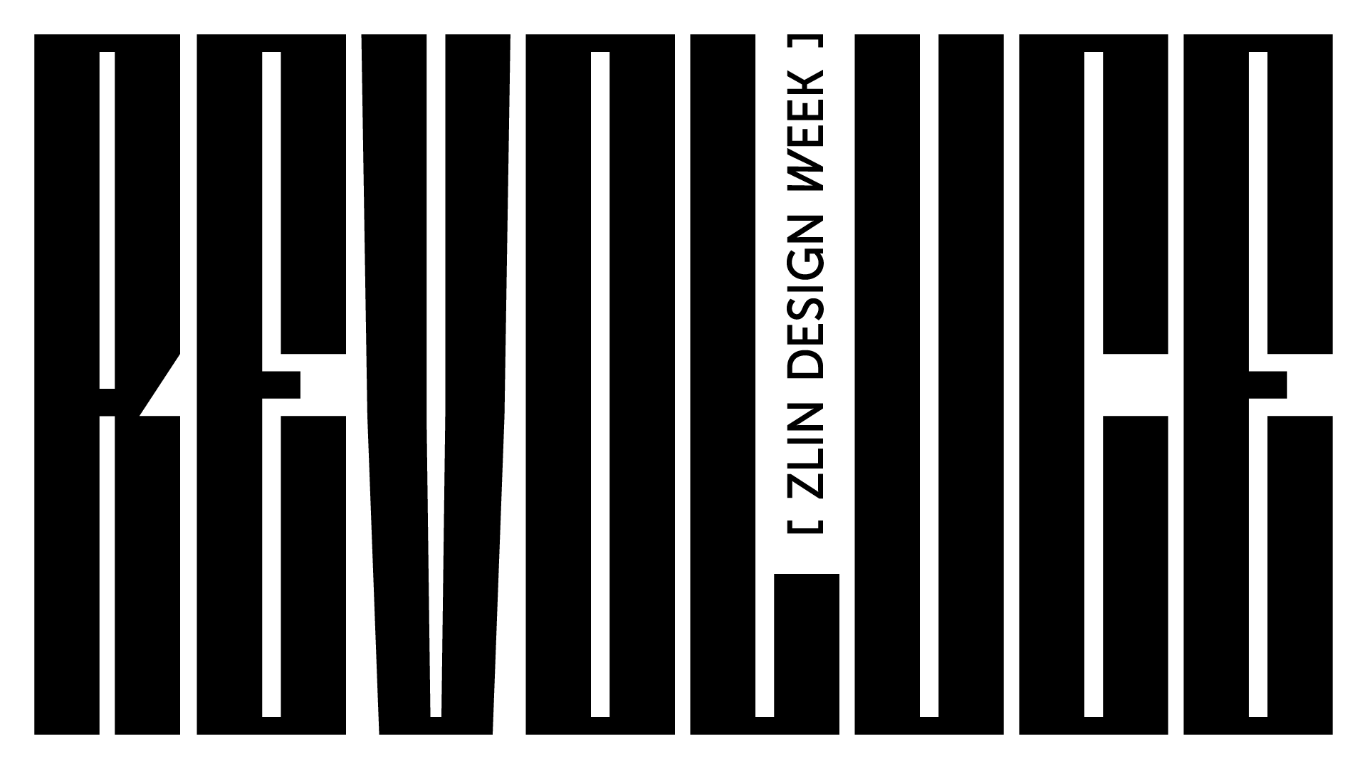
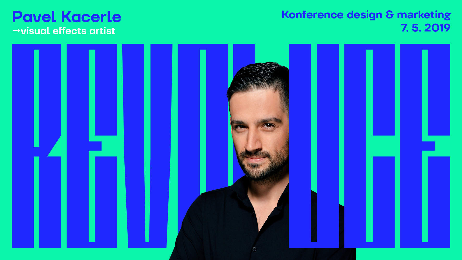
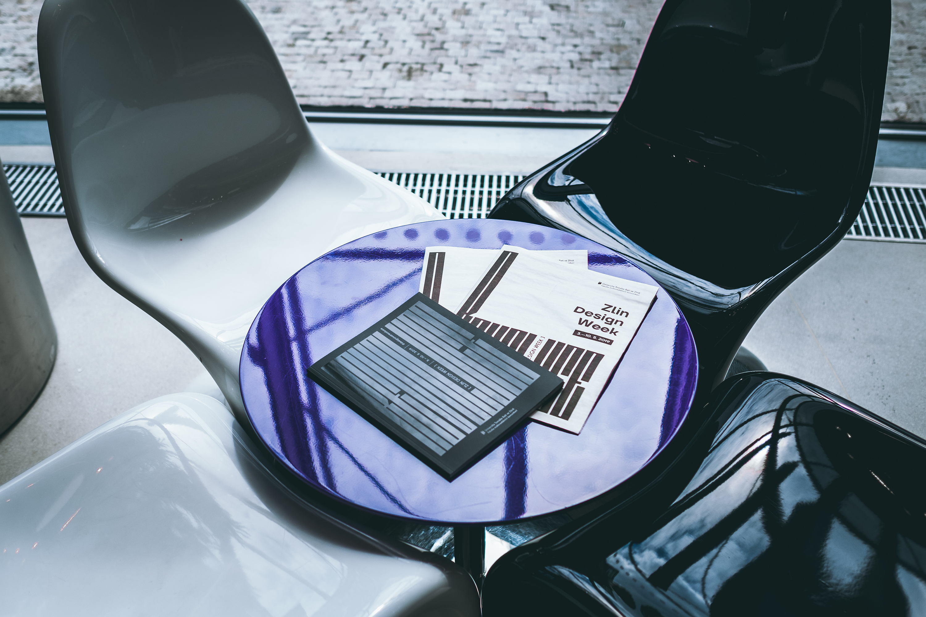
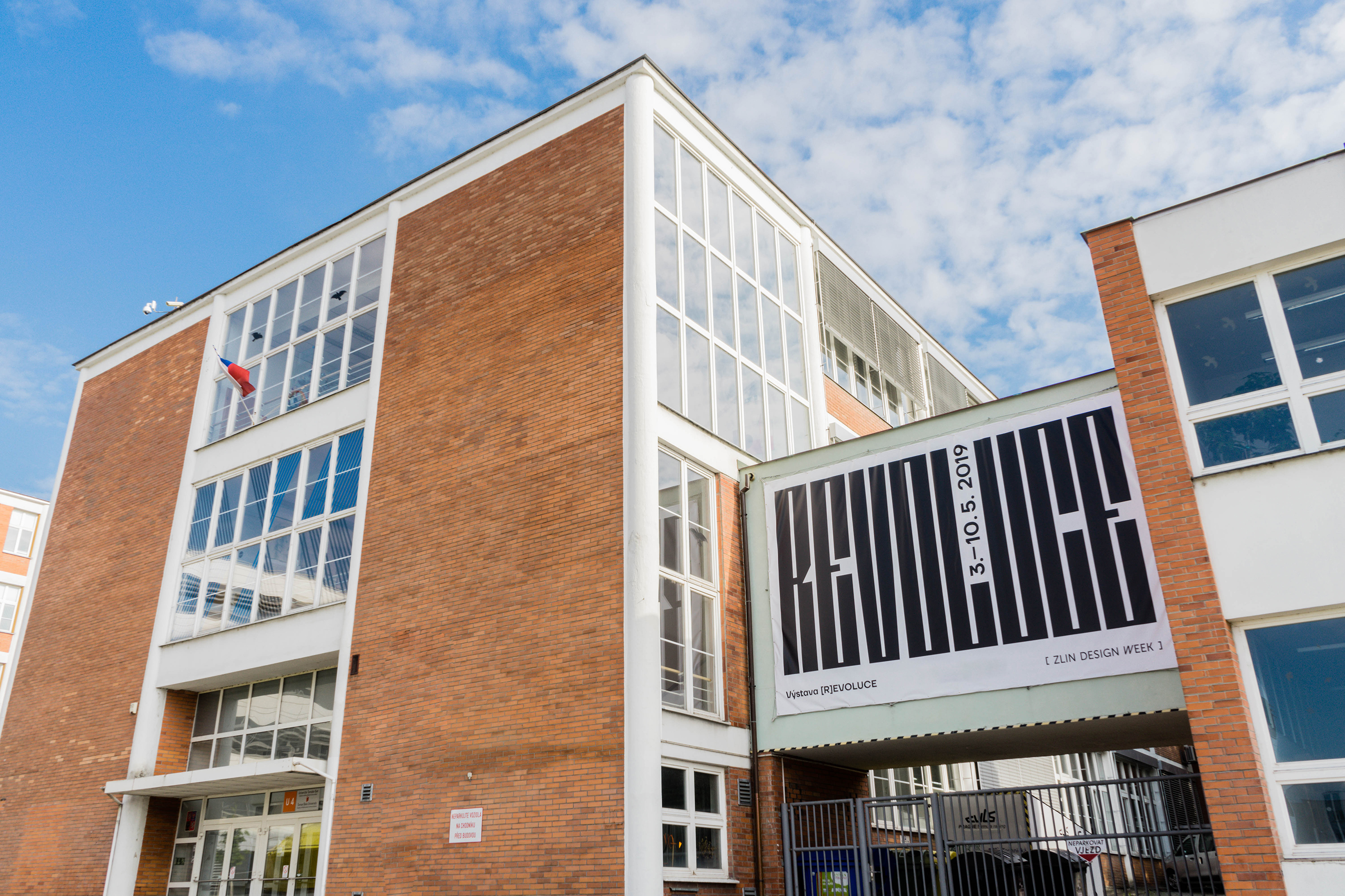
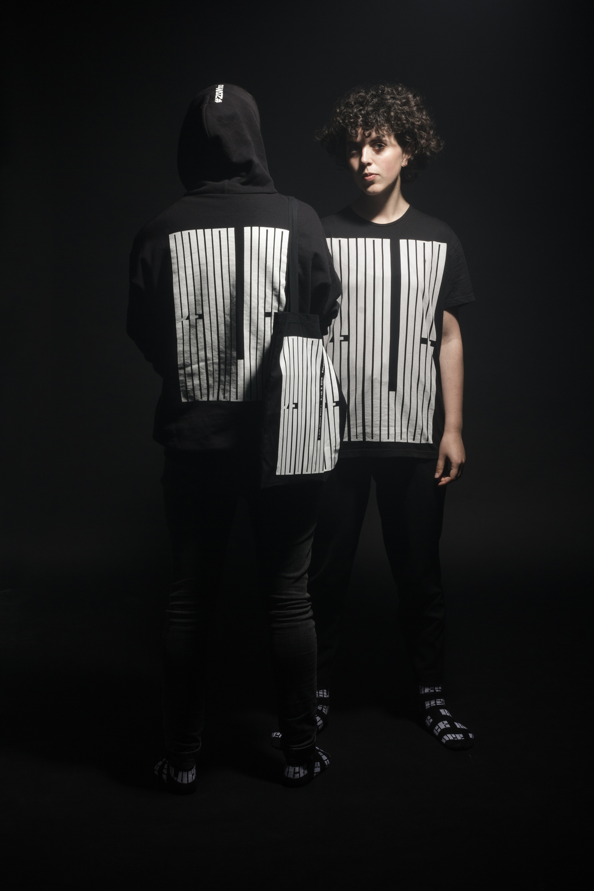
The concept is typographically based on the word REVOLUTION, which consists of three fixed parts, the rest is deformed to any height, which reminds of now widely used variable fonts – a revolution in typography. The word always adapts to the selected format. The gap in L is a distinctive expression that is used to either fill information about the event, or a photography is used with an object "flying throughthe gap" that can be viewed as a symbol of overcoming limiting restrictions in the revolution.
